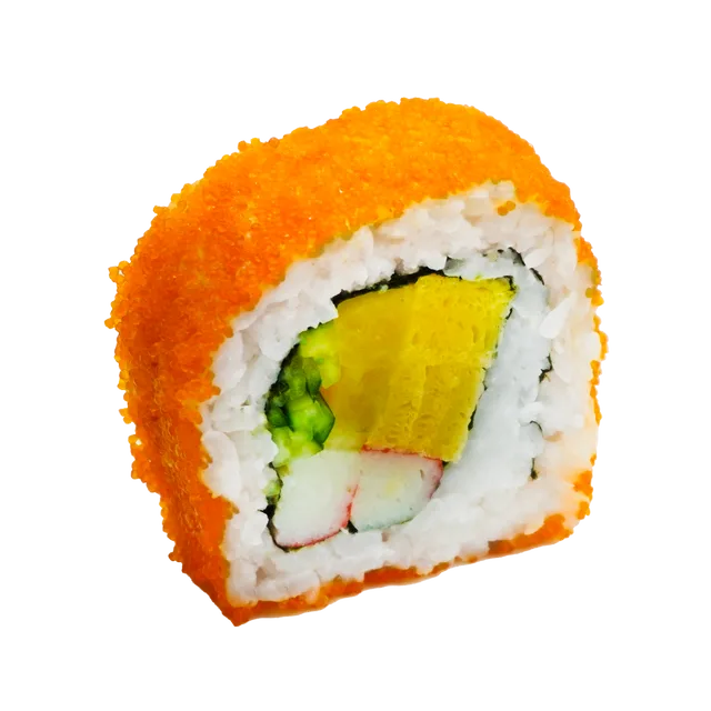
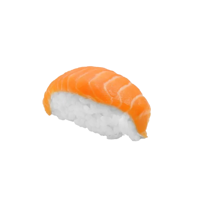
Dark red and black. A near-black page lit by a red glow, real sushi served on a black slate, heavy type, the red gradient bands from the brand deck. The one to compare against the two light designs.
Homepage: logo docks into the menu bar, platter is served in 3D, camera pans along the menu
Confident, corporate, strong for partners and joint venture enquiries
Clean near-white background in the brand's red, black and white, with the panda front and centre. Customers first (menu, nearest store, delivery); partners and joint venture details live on Contact.
Homepage: real nigiri, gunkan and rolls rain in and assemble onto a platter, the platter shrinks into the red brush ring and becomes the panda, then a giant SUSHI PANDA wordmark lands around it
Contact Us doubles as the partner page: RM173k package, cost breakdown, projected payback and outlet formats above the enquiry form